Ar ais arís (meaning: Back again) Ar ais arís
We were invited to do a personal or passion-project PechaKucha at our annual design team summit recently (hadn’t done one of those since about 2008), and I chose to do one on the Irish script.
In prepping for that I dug into the origin of the buailte - the dot over letters in the script indicating sound changes. It’s very logical!
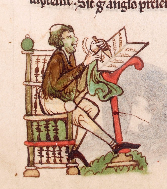
Scribes, like our friend here, captured by Geralt of Wales - spent all day laboriously copying Latin - making ink, scratching letter by letter. But what if they made a mistake, days into a page? They used the over-dot as an orthographic technology meaning “I have made a mistake, please ignore this letter”1.
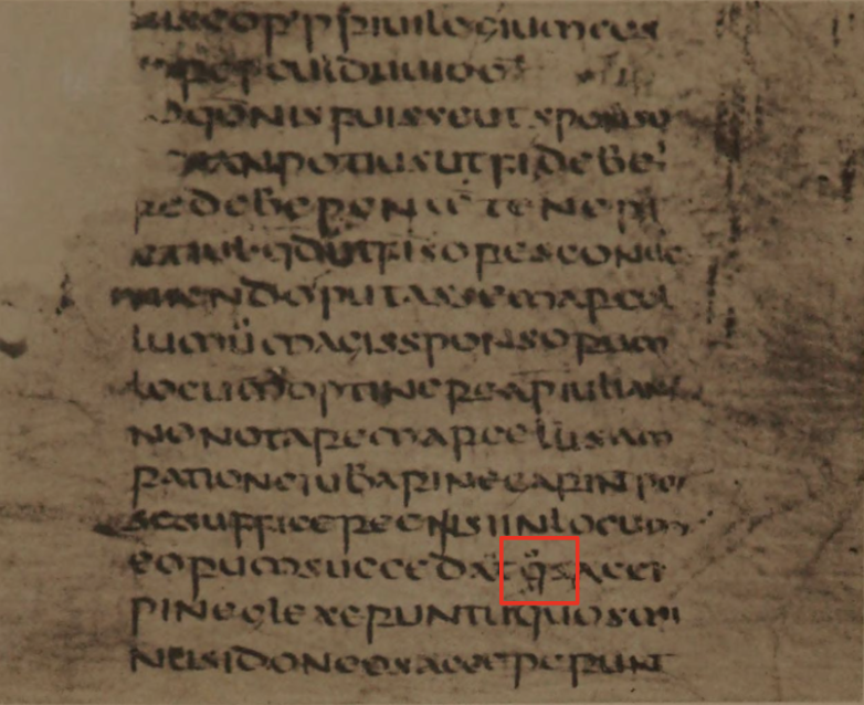
Scribes in Ireland were writing Irish in addition to Latin, and started using the over-dot to indicate letters that become silent and phonetically disappear with lenition, like the f in fhuair. (meaning: got) fhuair. This is as if to say “when reading, ignore this letter”. Over the next 300 years it spread to all the letters with lenition changes, and is my favourite feature of the old script.2
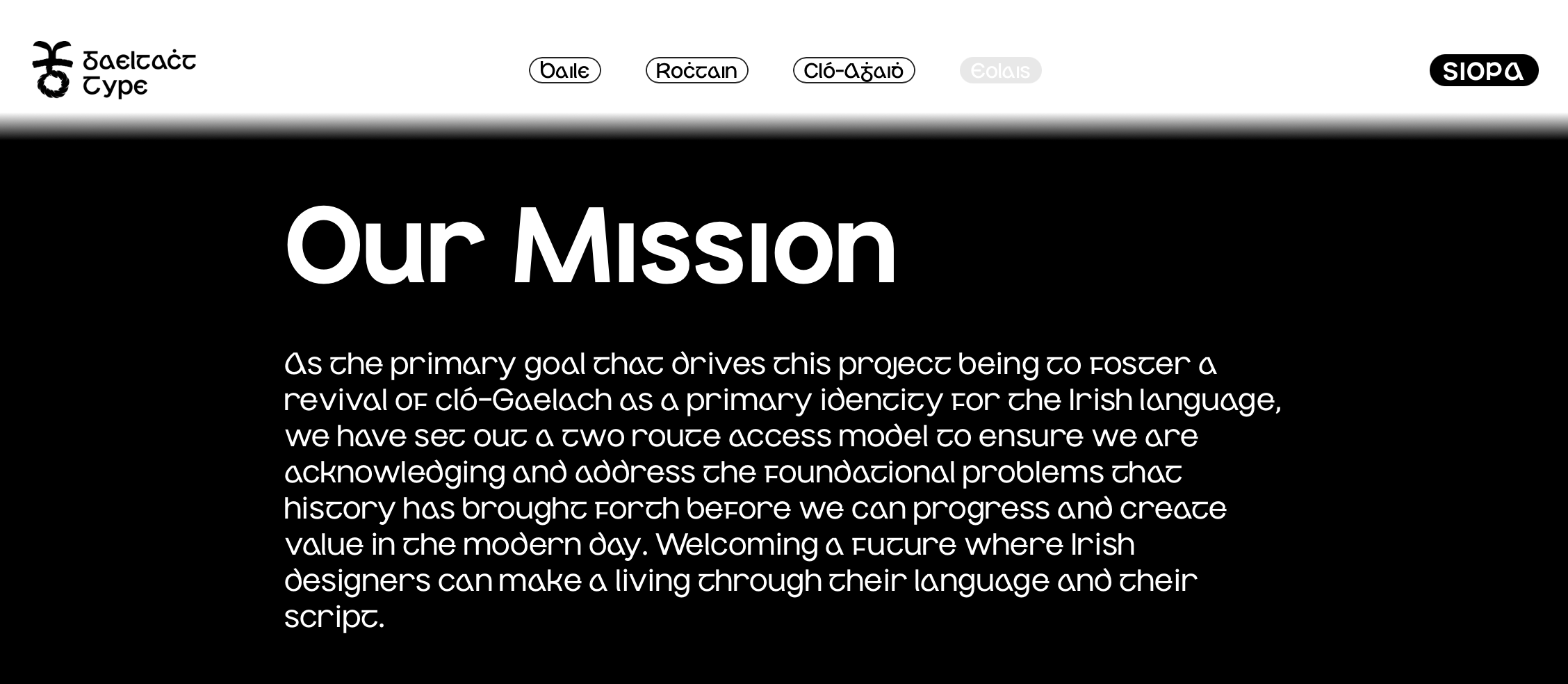
But also in researching, I came across a brand new type foundry - Gaeltacht Type, whose missions is to “foster a revival of cló-Gaelach as a primary identity for the Irish language” - let’s go!
I really like their first typeface Anois Sans, and since it comes with all the ligatures I had added to Úrchló (and a ton more stylistic options - check out the stylistic set toggles), I purchased a license and have switched over to Anois Sans for my Irish text.
I think one of the tragedies of switching away from the Irish script right as the modernist design era was about to happen was we missed out on all that mid-century design experimentation.
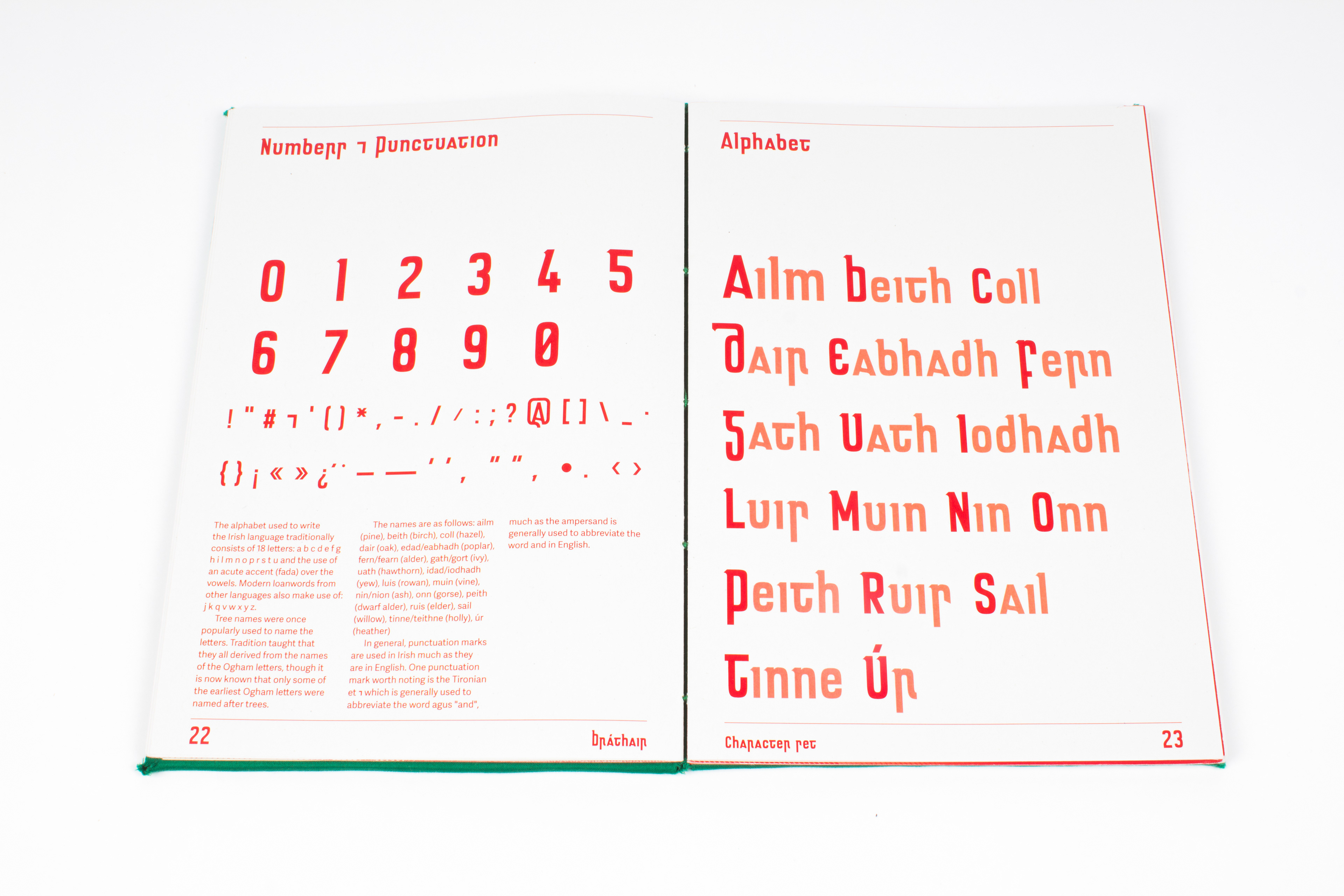
Some Irish designers have played with this idea - here’s a kind of Socialist period Slovak-Cló-Gaelach mashup called bráthair (meaning: brother) bráthair by Declan Behan from 2017 - super fun.
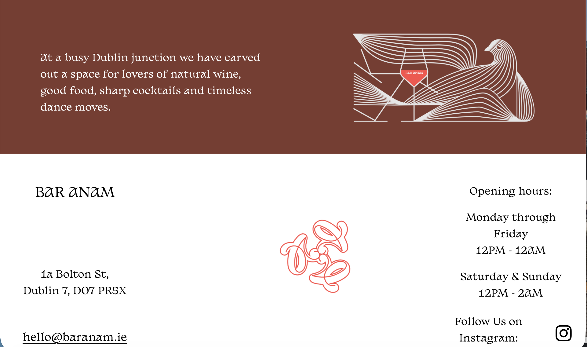
And I pass a bar going north through Dublin from my home called Bar Anam (meaning: soul) Anam . They have a great custom typeface that, while mostly art-nouveau, has hints of the Irish script particularly in the “a”. This is the kind of cross pollination I think maybe could have, or could yet still, introduce an Irish vernacular into modern design.
So: má tá tú ag scríobh i nGaeilge (meaning: if you are writing in Irish) má tá tú ag scríobh i nGaeilge b’fheidir súil a chaitheamh ar Anois Sans no chló Gaelach eile chun blás a chur air (meaning: maybe take a look at Anois Sans or another gaelic script to add flair) b’fheidir súil a chaitheamh ar Anois Sans no chló Gaelach eile chun blás a chur air
Footnotes
-
I looked up a textbook on paleo-orthography to try to find examples, I think there might be some on this page but I can’t be sure - I’d definitely take a correction on this. ↩
-
As fun as this is, the most notable invention of Irish scribes is still definitely the space between words. ↩
No webmentions yet. Link to this post to see your mention here!